Program Used
Illustrator
Photoshop
InDesign
WIX
Project Overview
Client:
Academic Project
Brief:
To create designs that captivate, engage, and communicate effectively. My company's idea is for another energy drink that is on par with Gatorade and/or Powerade with much more health benefits and a wider range of flavors that suit the consumer's taste. In addition to creating captivating visual identities and as well as making the website itself and how it functions and the thing I want to put on the landing page
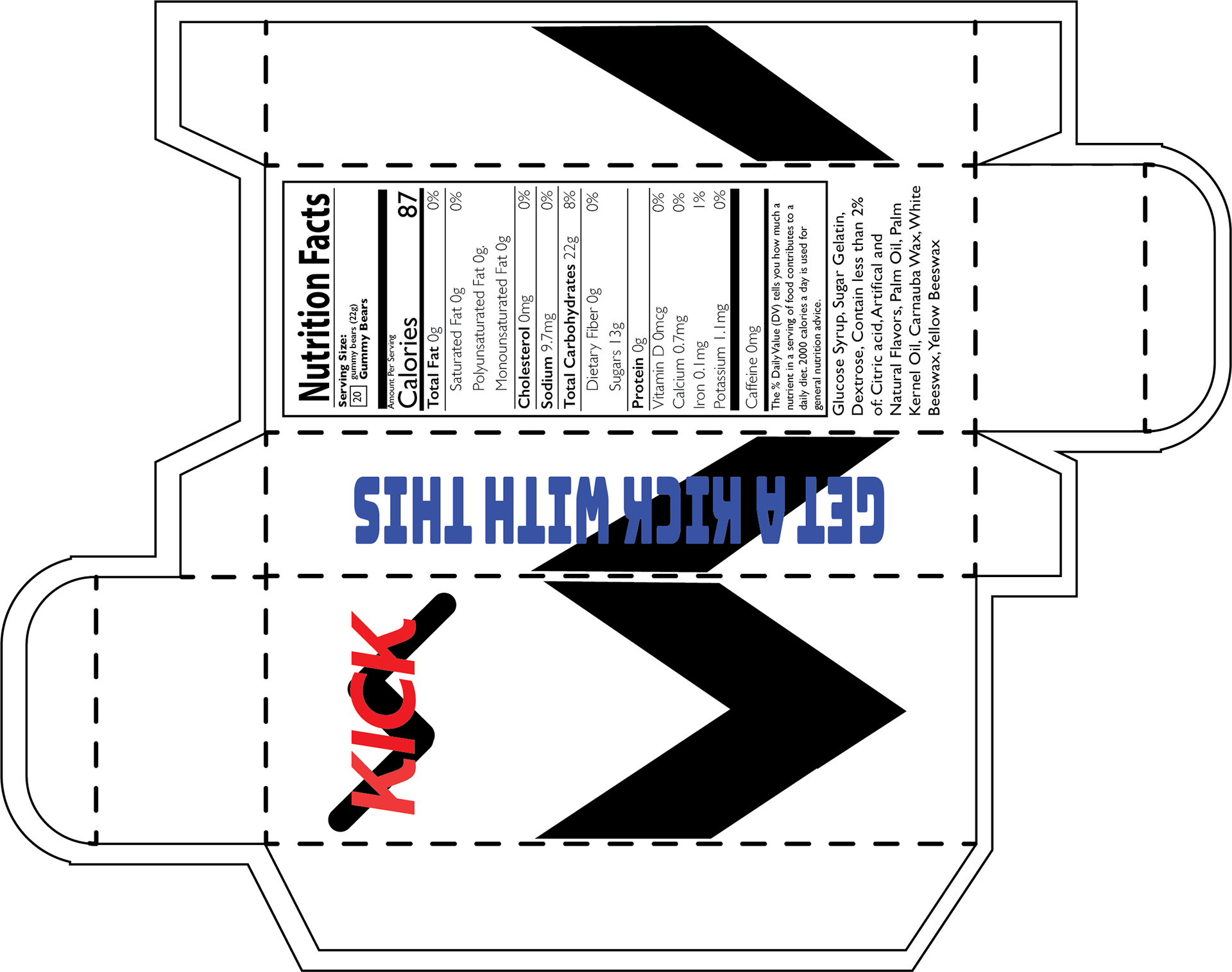
The blueprint of the Packaging for Gummies
Project Problem
Problem:
A problem that was encountered in this project is the company brand is an energy drink and packaging was something a little difficult since bottles and cans aren’t considered package
Insight:
An insight that impacted the design is the research of other energy drink brands and other products that they sell from their typical bottles
Solution:
Making other Products like gummies and powder that you put in your drinks are just some considered packaging
Process
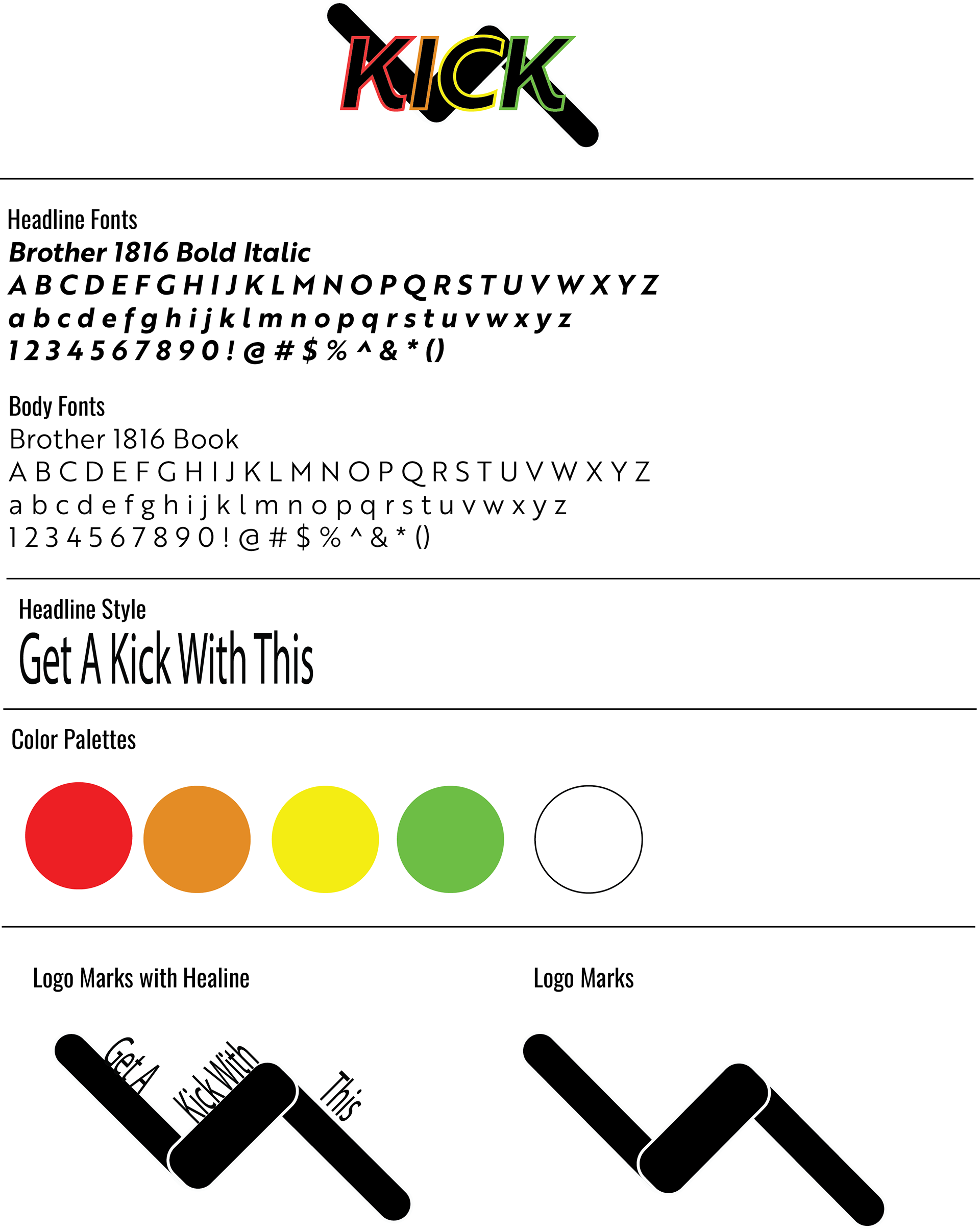
Different Logo Comps:
The zigzag mark can represent two things depending on how people see it one can show a leg that is about to kick or a somewhat of a lighting symbol
Color Palettes:
Using the color to represent the different flavors some include fruit punch, Orange juice, and lemonade. Whether it be in acting as the
Typography choices:
The reason to chose Brother 1816 is for simplicity but also some other energy drinks use fonts that are simple and easy to understand Gatorade is the best example since they use serif fonts and the iconic orange lighting.
Logo Sketching and Ideas
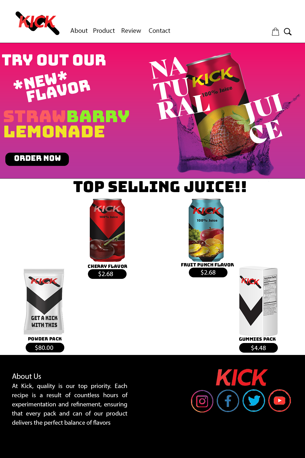
Final Website Landing Page
Results
With the final logo, I believe I made some that can be recognized with both the symbol and the type logo. With the website landing I Like how the Photoshop image was the approach to the website itself and the website the flow of it makes it look like an energy drink site with its interactive and stage landing page
Reflection
This project was both interesting and difficult, but there is also room to improve. This tested my skills using Illustrator, Photoshop, and Indesign for the rough and final draft as well as learning new skills that I picked up to help add to my design. not only that but it also give me the test to make an actual website from scratch.
For example, the packaging since it was my brand, particularly goes with Bottle or cans. But it was also difficult since we needed three pieces of packaging and it can’t be in the same category and also bottles and cans aren’t considered as packaging. I also hope to improve more on the packaging and expand more on the category aside from the typical drinking brand.